One more in a series?
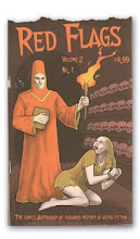
I tried to post this image a couple of times and the colors kept reversing. I finally figured out that I did the image in CMYK and never changed it for the web. It also gave me the chance to go back in and work a lot with it which has helped it come to life. I still think this one needs a little work as some areas I'm not happy with (that's always true, though). It also turned out a little less overtly sexy and a bit darker and more symbolic than the others so far but that's probably because I just let the pictures take me where they want to go and I like to see how intelligent erotica can get and not lose its essential sexiness to make it work. I dropped the text because I thought the content in the image was enough to carry it. While the others have been more about cheesecake and graphic design, this became about sensuality, femininity and a more fine art meets illustration feeling to its style.


No comments:
Post a Comment